What's new

Suggestions for Quiz Add-On

selamt

Validated license owner
Hi,

I installed the Quiz add-on and created a total of 11 separate quizzes.
It is a really impressive add-on.
I would like to write some suggestions both to contribute to the development of the plugin and to make it more visually pleasing to the eye.
I hope you will have the opportunity to apply them.
I will write each suggestion in a separate post. if you implement it, it will be easy to follow :)
Also, maybe other users can write their suggestions in this thread.

Thanks in advance.
 
Last edited:
Widgets can be created for quizzes.

Random Quiz
Popular Quiz(zes)
Last Added Quiz(zes)
...

By positioning these widgets where we want them on our site, we can make them more visible to users.
 
An option such as mandatory participation by users can be added.
When the user logs in to the site, they are directed directly to that page and are not allowed to go to another page without solving the test.
I think this option would be very nice as an option.
 
On my own site, I offer gift memberships (VIP memberships) to my users in exchange for solving tests. However, users respond casually, just so that they can participate in the test and win the gift.
To address this, a minimum amount of time can be set for users to solve a test.
For example, it is not possible to complete a 30-question test in 20 seconds. For this, a minimum of 2 minutes can be defined.
Thus, since the time spent on the site will be high, it will contribute to the reputation of the site on Google.
 
1735471364547.png

The Sidebar area on the right side of the Quiz Overview page is too full. This creates an unsightly appearance.
It would be better to show these sections not in the Sidebar, but in a tab-shaped area that works with Java Script at the bottom.
 
1735471636993.png

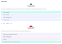
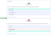
On the page where the Quiz Results appear, the information at the top seems to create confusion as to which problem it is.
Can we customize these fields with spaces in between?
As in the picture

1735472336096.png
 
View attachment 1359

On the page where the Quiz Results appear, the information at the top seems to create confusion as to which problem it is.
Can we customize these fields with spaces in between?
As in the picture

View attachment 1360
You can paginate all the questions so that only 1 is shown per page and it is less confusing. I have it set up like this to avoid scrolling down the page (especially when it is a quiz with 100 questions for example)
 
That's one option... but at least what's wrong with each outcome being more clearly differentiated from each other?
I think it would be tiring for the user to go page by page for each result.
 
Back
Top